Humboldt Park, Chicago
Story
September 07, 2021
Listening to the Data: An Intern Perspective on Air Quality Monitoring
Some highlights and insights from my summer spent monitoring air quality throughout Humboldt Park and the surrounding neighborhoods.
By Devon Snyder, ELPC Policy Intern, Summer 2021
This summer, I joined the team of Air Quality Chicago. Beginning in June, my fellow interns and I were tasked with walking various routes to track a number of air quality factors. We primarily focused on fine particulate matter, also known as PM2.5, which poses a risk to respiratory health and overall wellbeing. In addition to PM2.5 causing a number of health impacts, especially for sensitive populations such as children, older adults, and individuals with existing heart and lung diseases like asthma or COPD, it also contributes to environmental damage.
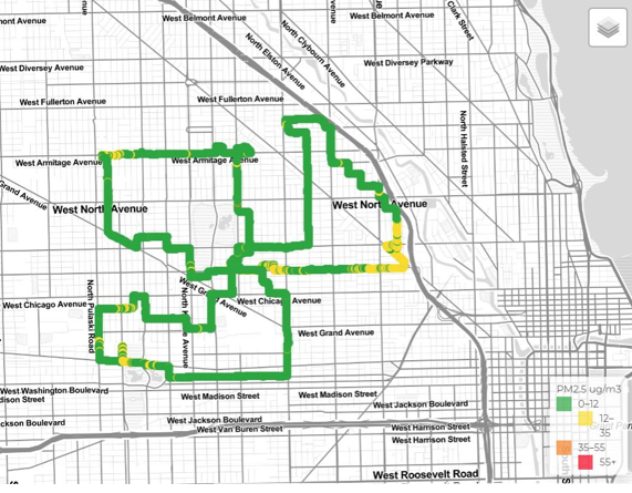
Humboldt Park and surrounding neighborhood route. Green indicates pretty good air during the week of June 7th.
I covered the areas around my home in Humboldt Park, including Hermosa, Garfield Park, Ukrainian Village, Noble Square, Wicker Park, and Bucktown. My routes followed corridors with high levels of previous data collection, as well as sections that were missing data. Below are some highlights and reflections from the summer monitoring.
PM2.5 Progressively Worse Throughout July
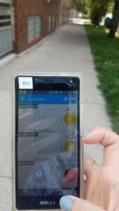
Cell phone app shows handheld monitor data increase in PM2.5 following 4th of July weekend.
I was surprised to see PM2.5 levels remained relatively low and fairly consistent throughout the nine-week monitoring period. Only at the end of my internship did I notice consistent days where the average trended towards 12-35 micrograms per cubic meter of air (μg/m³).
- Fireworks – One possible influence could be the increase in fireworks leading up to and following the Fourth of July. Living near Humboldt Park, fireworks are a regular occurrence, and they impact air quality in the neighborhood and around the park.
- Weather – Another possible influence could be the increase in relative humidity and heat throughout the month of July, which can have a direct relationship with PM2.5. I noticed that on days with higher humidity it was hazier and harder to breathe.
- Forest Fires – July forest fires throughout parts of Ontario and First Nation Communities in east-central Canada and the western United States impacted Chicago air quality as well. Smoke from the wildfires created noticeable haze during the better part of the month and resulted in higher levels of fine particulate matter.
-
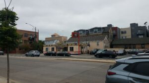
A restaurant on Ashland that caused a spike in PM2.5. The restaurant is located across the street from an elementary school playground.
Localized Sources – When spikes in PM2.5 levels did occur, they tended to result from recognized sources of pollution. Restaurants, personal barbecues, cigarette smoke, and construction were the main causes of high PM2.5 counts. The spikes happened mainly along busy corridors, like Ashland, Western, and North. There were also several instances of when spikes occurred and I was not able to detect the source – either by sight, smell, or sound.
- Experiencing PM10 – There were times when I could smell possible instances of pollution or my breathing was impacted though the Airbeam monitor did not show an increase in PM2.5. I found it curious that I would feel the impact of the air quality without it actually setting off any spikes. This tended to coincide with an uptick in PM10 – the larger level of particulate matter often associated with pollen and other allergens, which our monitors read in addition to other air indicators.
Neighborhood Variations Followed Known Patterns of Environmental Justice
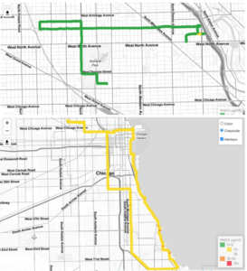
A ride along the North Side 606 (top image) elevated bike path, compared to a ride taken down Martin Luther King Drive and up the Lakefront path on the South Side (bottom image).
The days I walked west showed higher average PM2.5. West Humboldt Park and Garfield Park averaged 7.3 and 7.5 μg/m³ (respectively), while in Ukrainian Village, Wicker Park, and Bucktown, the average was closer to 5.7 μg/m³. This variation follows known patterns of environmental racism throughout Chicago’s West Side. These neighborhoods have higher percentages of communities of color, who shoulder the burden of the environmental damage and industrial health risks. I found this data to be especially relevant given the current conversations being led by groups like Little Village Environmental Justice Organization (LVEJO) regarding truck traffic’s negative impact on community health, as well as the ongoing debate over the relocation of General Iron from the north to the south side.
Potential for Future Monitoring by Bicycle
As an avid bike rider – for commuting, recreation, and exercise – I was interested in seeing how air quality changed when I went from walking along the sidewalk to monitoring in bike lanes. I wasn’t able to actively watch the PM2.5 count and mark any spikes or sources of pollution, but I usually could anticipate the monitoring results based on how I felt while riding. I do generally feel more impacted by sources of pollution – like exhaust and road construction – on my bike compared to when I am on the sidewalk. As someone who wants biking in Chicago to be accessible and safe for all types of riders, it is important to consider the environmental risks involved in developing bike lanes.
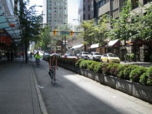
Protected bike lane in Seattle, with vegetative buffers. Infrastructure like this could protect vulnerable road users from collisions and help mitigate air pollution exposure.
Biking is often seen as a solution to a city’s pollution concerns: more bike lanes = more bikers = fewer cars on the road. But that equation fails when the general well-being of bikers isn’t taken seriously. Connecting the dots between air quality and cycling traffic around Chicago could potentially help in developing better alternative transportation policy. I look forward to furthering this research, connecting with bike advocacy and environmental justice groups, and possibly working with ELPC on establishing the program in the future!